
Cards
Our Card Styles and Usage
Overview
Cards are a great pattern for grouping like content into a visual container. They should be easy to scan for relevant and actionable information. Elements, like text and images, should be placed on them in a way that clearly indicates hierarchy. They should remain identifiable as a single contained unit. They cannot merge with another card. Nor can they be broken up into multiple cards. They can, however be surrounded by supportive content. Or they can stand alone, not relying on any surrounding content.
Card Names
We leverage a handful of different card patterns and to simplifier communications we use the following names to refer to different types of cards
Basic | This is our default card style and the most flexible, it has multiple variations |
Image Card | This is often referred to as a media card. It is a variation on the basic card that involves using imagery for either the background or the header |
Horizontal Card | This is card is usually used in lists and often leverages avatars as part of their design patterns |
List Card | List Cards are great for displaying information in a list format. |
Form Card | Form cards have forms embedded in the supporting content section. |
Product Card | This is a rich interative card that showcases our products but can be used in other patterns as well. |
Basic Cards
Cards are molecular components that can be employed inside larger organisms (see our List Widgets and Product Cards, for examples). They also can be used on their own to compartmentalize content of a particular focus.
A basic card consists of a container bordering a title element above some supportive content. Supporting content can contain text, links, calls to actions, etc.
Style Properties
| Background Color | Box Shadow | Border Radius | Border Style | Padding |
|---|---|---|---|---|
| White (#ffffff) | 0 1px 2px 0 rgba(0, 0, 0, 0.2) | 4px | 1px solid rgba(0,0,0,.125); | 30px |
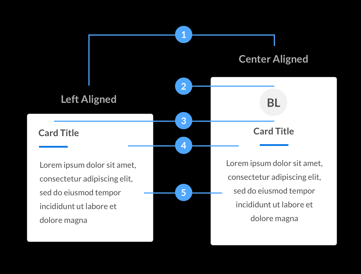
Alignment
Card content can be left aligned or center aligned but never right aligned.
Avatars
For center aligned cards an avatar can be added for visual support.
Title
Not All basic cards require a title but if used, make sure the title is short but descriptive.
Horizontal Rule
If a basic card contains a title we always use a horizontal rule to divide the title from the supportive content.
Supportive content
The content area of a card can take many shapes. The only rule for card content is that it is related to the title if applicable.
Examples
Beeline Manager
Beeline Manager is great way to manage all of your contingent workforce needs from your mobile device.
Learn MoreCost Savings
Eliminate rogue spending. Consolidate suppliers. Benchmark rates.
John Doe
Structural Engineer
Image Cards
Image cards are for rich media content, usually in the form of an image with supporting text or calls to action.
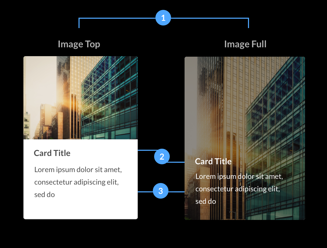
Layouts
Image cards come in two layouts. The image top places the image in the header of the card, and the image full has the image scale the entire width and height of the card.
It should be noted that there should no border around the image. The image should stretch vertically and horizontally to the edges of it’s container.Titles
Image cards have an optional title, however with image cards we do not use a horizontal rule.
Content
Content is always placed at the bottom of the card. When using an image full card, per our image overlays guidelines, the content must be readable.
Examples

Beeline Manager
Beeline Manager is great way to manage all of your contingent workforce needs from your mobile device.
Learn MoreOperational Efficiency
Automate procurement cycles. Reduce time to fill positions.
Horizontal Cards
Horizontal cards are great for lists, dashboard widgets, stat charts and many other applicable content. They are often clickable and can be used to trigger events. If they are clickable they have a distinct hover state which you can see in the examples below.
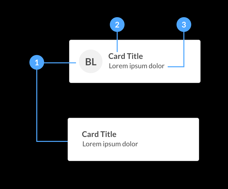
Avatar
Avatars are optional but can be used to add more visual context to the card content. They are placed to the left of the title and content sections. As the content area grows vertically the avatar should remain positioned at the top of it’s container, not centered or at the bottom.
Title
For horizontal cards titles are required but we do not require a horizontal rule to seperate the title from the content.
Content
Content is placed below the title. There is no limit to how much the content can grow vertically, and also, the content should be left aligned with the title even when it wraps.
Examples
Did you Know?
Find out how companies are using brand-enabled, AI-powered, self-sourcing capabilities to build private talent pools of previously identified talent with TalentNet technology seamlessly integrated to Beeline VMS.
John Doe
Systems Architect
Jacksonville Fl, 904-555-5555
List Cards
List cards are a great way to showcase items that need to be ordered in a list. They are a combination of a basic card with list cards as the content. We often use them for dashboard widgets but they are very flexible and can have many uses.
-
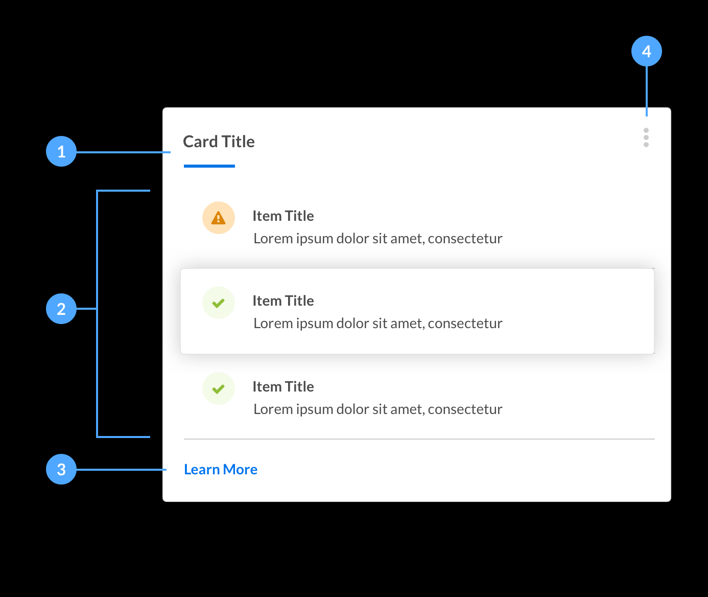
Title
All list cards require a title, this allows the user to know what the purpose of the list is.
-
List Content
The content area is made up of list items that follow the same structure as a horizontal card without the rounded corners and drop-shadow. If the items are clickable on hover we display the rounded corners and dropshadow. We also change the cursor to a pointer. This indicates to the user that the item is clickable and can be interacted with.
-
Call To Actions
Call to actions are optional. They are placed below the content and left aligned with the content to allow the user to track the content from top to bottom.
-
Context Menu
Context menus can be added to a List Card for times when a card can have hidden actions such as delete, export, or copy. They are located in the top right corner of the card and use an ellipsis icon.
Examples
Form Cards
Link Another Account
Product Cards
We use product cards to showcase our services and VMS instance from the Beeline One Launchpad. It’s a good example of how versatile the cards are for delivering like content.