Login Screen
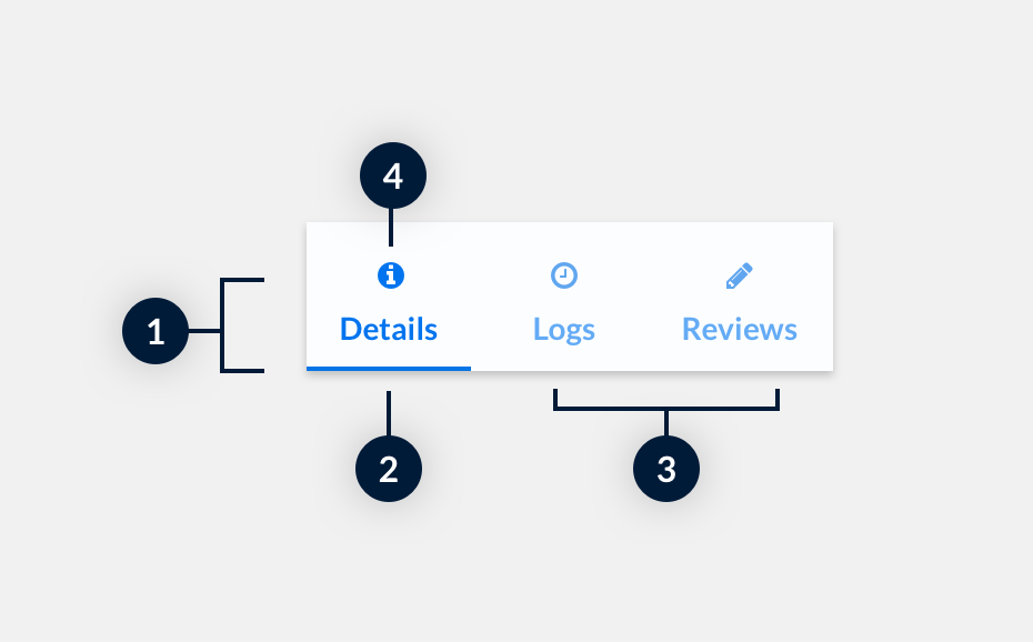
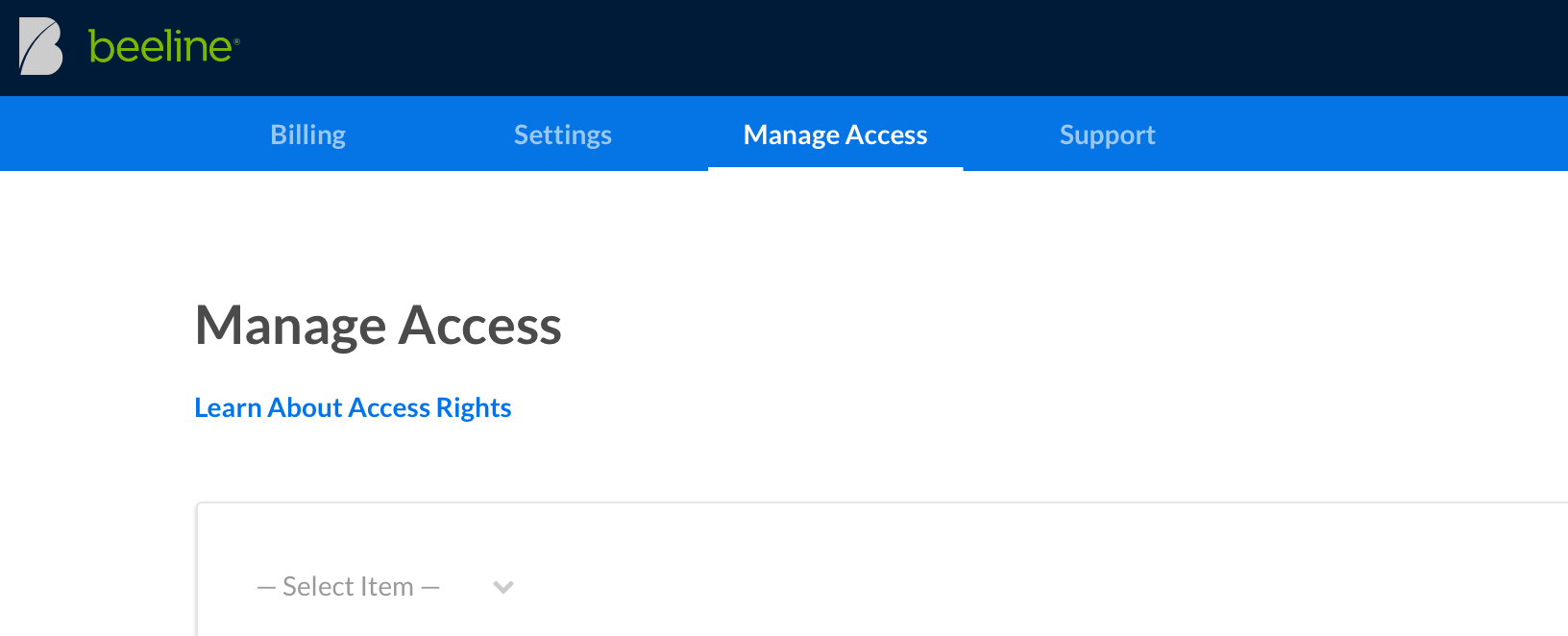
Here we use tabs as navigational elements to switch between different account management pages.
Pricing Table
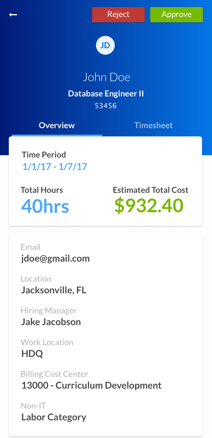
On our mobile views we use tabs to switch quickly between related content without having to navigate to a new screen.

Here we use tabs as navigational elements to switch between different account management pages.
On our mobile views we use tabs to switch quickly between related content without having to navigate to a new screen.