
Cards
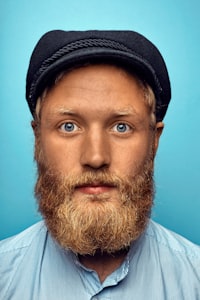
Avatars can be used to add context to a card
Top Candidates
Bill Lowry
Jackosnville FL, 322224
Karen Row
St. Augustine FL, 32080
Joe Walsh
Jacksonville FL, 32225
List Widgets
Avatars can be used to add context to list items. This can include icons, headshots, or initials
Mobile Actions
Avatars on mobile can be used to add visual context to clickable items.
Mobile Status Icons
Avatars can be used to show status icons to add additional visual context.
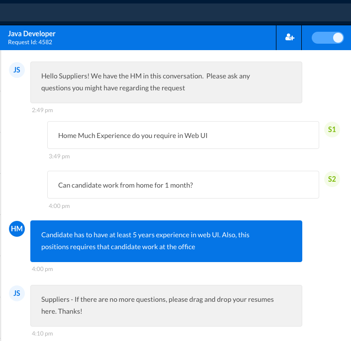
As Initials
When an icon or image doesn't fit, avatars can be applied using initials. Here we show an example of our Agent chat experience and we see initals being used to indicate which user is related to which chat bubble.
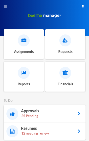
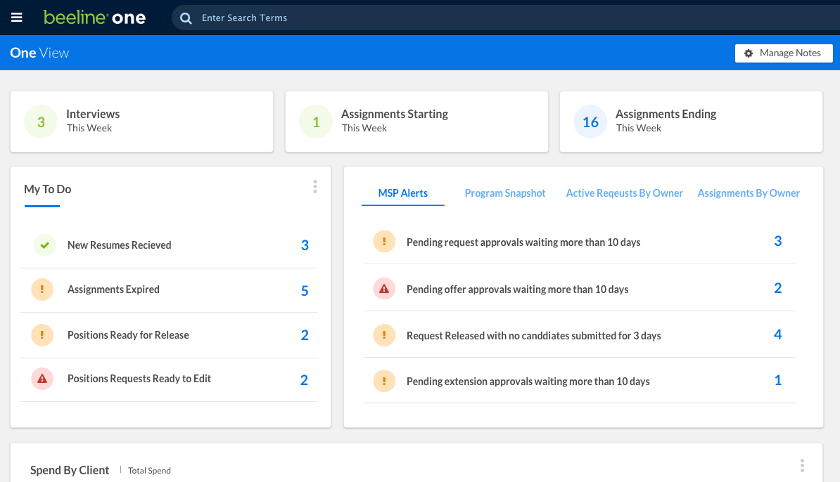
Dashboard Widgets
Here we see avatars being use as status indicators, as well as, stat counters for our stat charts.