
Modal
Modal Styles and Usage
Overview
Modals are used to inform users about a task, event or request. They acquire the user’s attention by presenting a dialog in front of the content being viewed at the time of execution, interrupting the user with a combination of a lightbox and call to action. Modals allow us to engage the user’s primary focus without taking them to a new screen. Keep in mind that modals are purposefully interruptive, so if by using a modal you are hindering the user’s ability to make an informed decision, an Action Panel might be a better solution.
Style Properities
| Modal Background Color | Modal Box Shadow | Modal Border Radius | Modal Border Style | Overlay Color |
|---|---|---|---|---|
| White (#ffffff) | 0 1px 2px 0 rgba(0, 0, 0, 0.2) | 4px | 1px solid rgba(0,0,0,.2) | rgba(0,0,0,.5) |
Modal Types
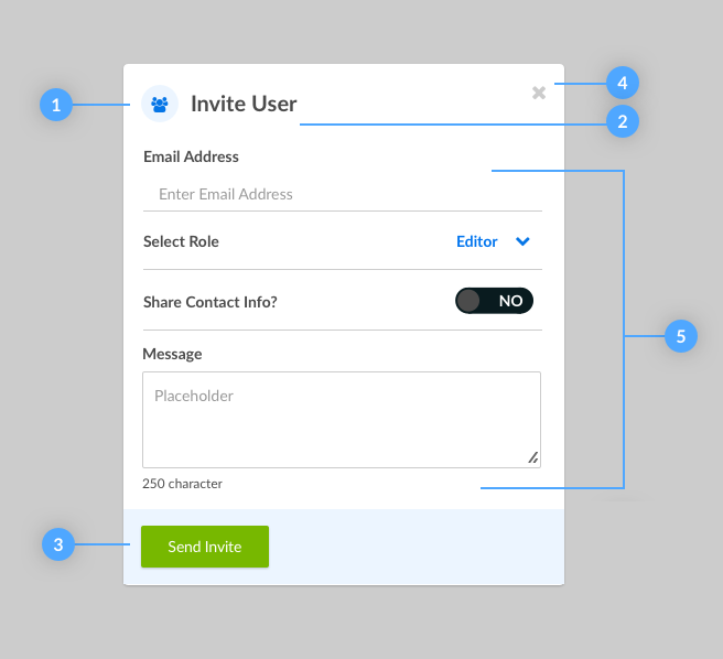
Form Modal
For small forms, 1-5 fields long, using a modal can be a better option than taking the user to a new page. For longer forms use an Action Panel
-
Supportive Avatar:
Select an icon that is relevant to the title -
Title:
Title’s should be short and descriptive -
Call to Action:
Call to actions in form modals are always left aligned, and use the primary color -
Close Action:
Close action is always located in the top right of the modal and is optional -
Form Elements:
Form elements make up the body of the modal and should not exceed 5 elements
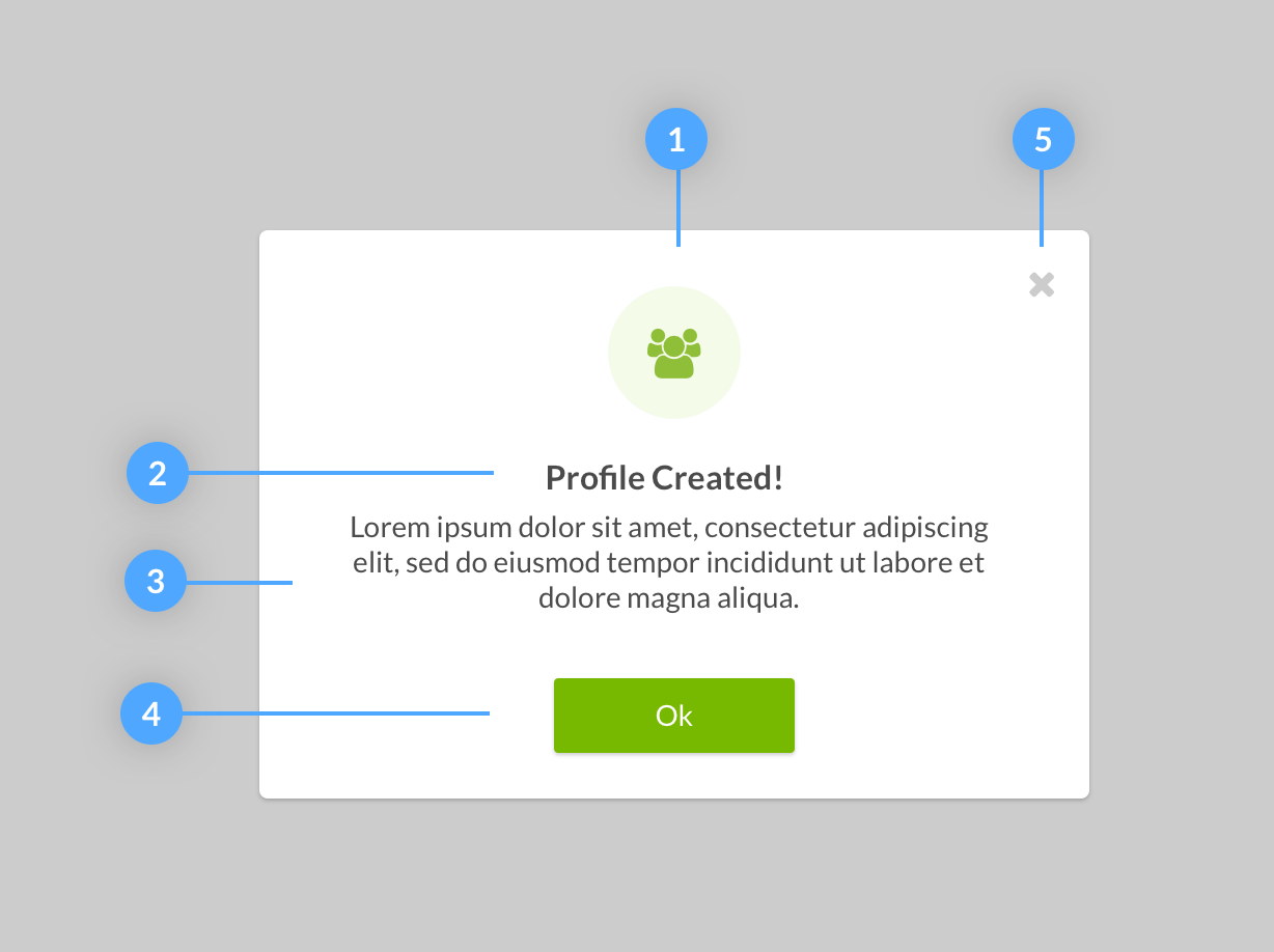
Notification Modal
Notification dialogs are great for notifying the user of consequences from actions. They can be used in similar situations as Notifications. The main difference is they are more disruptive than a notification because they don’t allow the user to proceed without confirming they’ve read the message.
-
Supportive Avatar:
Select an icon that is relevant to the title. The avatar should be center aligned -
Title:
Title’s should be short and descriptive and centered within the modal -
Message:
Message should follow our Voice & Tone Guidelines and be center aligned -
Call to Action:
Call to actions on notification modals are always centered with content. -
Close Action:
Close action is always located in the top right of the modal and is optional
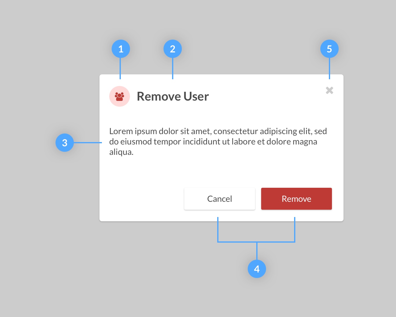
Confirmation Modal
Confirmation dialogs are a great way to require the user to stop and think before continuing with an action that could potentially have a great impact on future decisions. Some examples include deleting a record or proceeding with a walkthrough. Confirmation modals differ from notification modals in that they always give the user a way to back out their decision. This is usually in the form of a cancel button or close button.
-
Supportive Avatar:
Select an icon that is relevant to the title. -
Title:
Title’s should be short and descriptive and centered within the modal -
Message:
Message should follow our Voice & Tone Guidelines and be left aligned -
Call to Action:
Call to actions should be located in the bottom right of the modal. There should always be two buttons. The left button is the back out button or cancel button. This button is always our Neutral button The right button is the final call to action. The final call to action button should be either our Primary button or our Danger button depending on the message. -
Close Action:
Close action is always located in the top right of the modal and is optional
Lightbox Effects
Transitions
Because the modal interrupts the user’s view, we use animation to retain some fluidity to the overall experience with the product. When launching a modal, either use a fade in or slide down from the top animation to transition the modal into view.
Invite User
Getting Started
We've made some exciting improvements to Services Procurement. Would you like us to walk you through these changes?
Remove User
Are you sure you want to remove John Doe from this talent pool? This action cannot be undone and you will lose all saved data for this candidate.
Profile Created!
We've successfully created a profile for Avia Staffing Resouces. You can now use this profile to add candidates