
Notification Styles
Notification Styles and Usage
Overview
Notifications are a low intrusive method of communicating content to the user. They can be positioned to dynamically appear and are typically used to communicate responses from the system. They have color states and iconography to support their purpose.
Colors & Iconography
We leverage 4 types of notifications. Each notification has a specific color and iconography
Informational
Informational notfications are used to give the user additional information that isn’t a result of an event.
| Color | Icon |
|---|---|
| Blue 1 |
|
Success
Success notifications are used to inform the user of a successful action, this action could be user generated or system generated.
| Color | Icon |
|---|---|
| Green Primary |
|
Danger
Danger notifications are used to inform user of errors or failures.
| Color | Icon |
|---|---|
| Red 1 |
|
Warning
Warning notifications are used when an event or action triggers merrits a warning message.
| Color | Icon |
|---|---|
| Orange 1 |
|
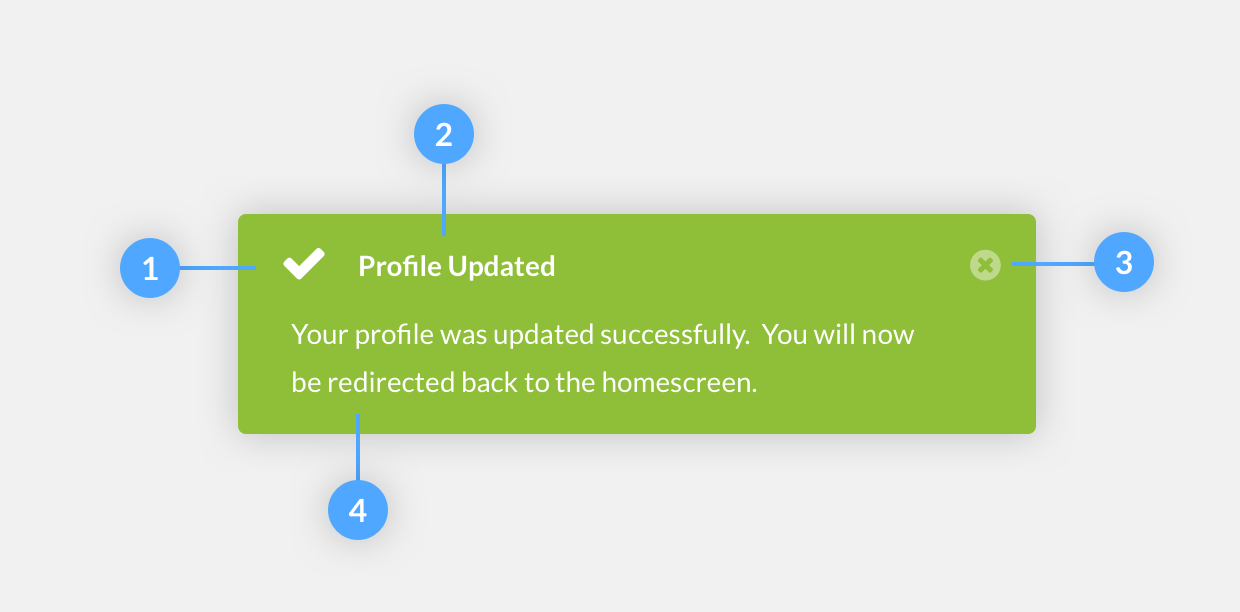
Structure
-
Icon
See Colors & Iconography of this page to find out which icon goes with which notification type. Icons are always required
-
Title
Title should be short and to the point
-
Close Option
Close option is required. We never want to put the user in a situation where he can’t manually dismiss a notification.
-
Message
Messages are not required but can be added to assist the purpose of the notification.
Styles
In case you didn’t already know. This is an informational alert
In case you didn’t already know. This is an success alert
In case you didn’t already know. This is an danger alert
In case you didn’t already know. This is an warning alert
Positioning
While notifications serve as a purpose of being less obtrusive and interruptive than a modal, they should appear within the viewport. However, the placement should not block the user from completing their task at anytime. We have three options available for positioning.
-
Docked
Docked notifications should be a direct informative message that is placed across the width, at the top or bottom border of the body of content. This type of notification is great for system wide notifications and there should only be 1 docked notification on thes creen at any given time.
-
Floating
Floated notifications should be placed in a suitable location of the user interface. A location that does not obstruct important content. But still acquires the user’s focus. The content of a floated notification should provide updates on an app’s process.
-
Form/Inline
An inline form notification is to be placed within a form or form modal. And it should be reserved for fatal error messages, HTTP failures, etc.
Transitions
A notification should employ animation when being executed. And should not have a jerky, instantaneous appearance. Animated feedback focuses attention on what’s important without creating unnecessary distraction. It also displays the hierarchy between the parent element (a viewport) and child elements (the messages).
Notifications VS Modals
Notifications should communicate messages that are minimally interruptive. And they should not require user action. If you require a user response or acknowledgement, you should consider using a Modal