
Hero
Hero Styles and Usage
Overview
A Hero is one of the easiest ways to grab a user’s attention and make an immediate impact for content introduction. They are usually placed at the top of the page before any of the content. By using bold, graphic, and intentional imagery we can immediate engage and orientate the user to the purpose of the view.
Structure & Layout
-
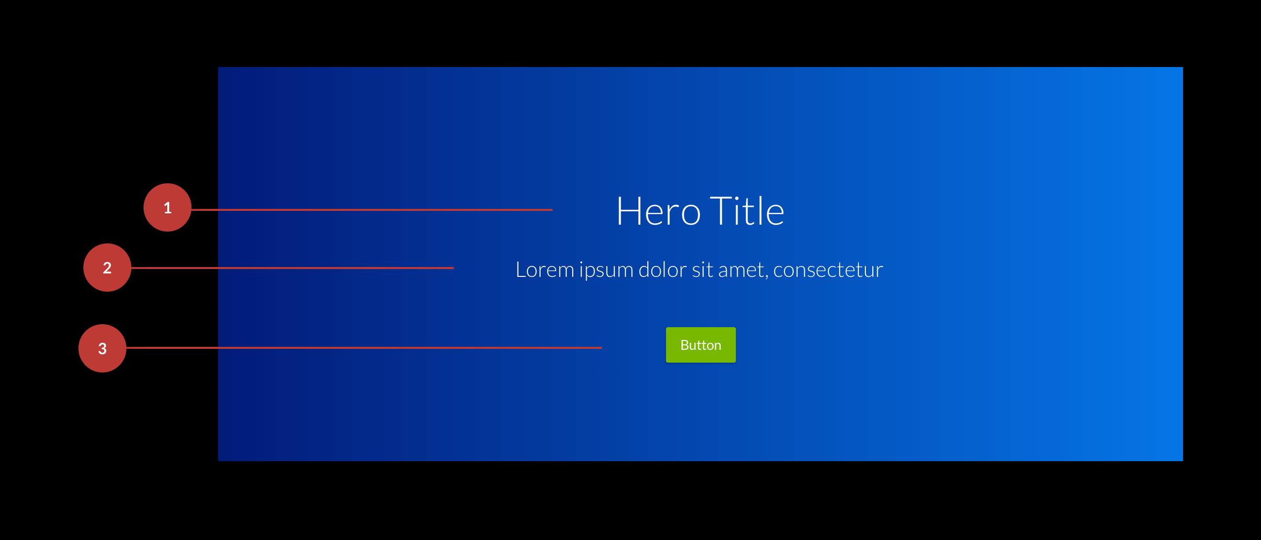
Title
Titles are required and should be descriptive but short. -
Short Description
Any time we can add additional context to a visualization we should do so. However, we realize this is not always necessary or available. So for that reason, short desciptions are optional but highly encouraged. -
Call To Action
Call to actions should be placed below the title and short description. They are optional and not required.
Sizing & Alignment
Sizes
| Style | Padding | Description |
|---|---|---|
| Standard | 150px 0 | Used for most pages, relies on padding and a grid system for positioning |
| Full Screen | N/A | Used for logins, sign ups and marketing pages. The Hero should take up the entire view port height and width. The content should be centered vertically. |
Alignment
Content within a Hero can be aligned left, center or right. However, the content should always be centered verticallyUsing Imagery
Use High definition, emotionally persuasive imagery.
A low resolution image expanded across the entire width of a large viewport will not be an acceptable product. Consider resizing your HD images for smaller viewports.Design with Contrast
The easiest way to ensure a legible statement is to overlay the image with a translucent black. This increases the contrast of your content. Also, orient your text content so that the focus of your image is not obstructed It is important that the photos and videos we use to support our content match our brand style and values. To learn more about using imagery in our products visit the Imagery documentation in the Brand Guidelines. Learn More About Imagery GuidelinesGradient Hero Styles
Our Blue Gradient hero is our standard Hero. We use it on internal pages, login screens, and a few other patterns.
Content Centered
Example of center aligned content
Content Left
Example of left aligned content
Content Right
Example of right aligned content
Image Hero Styles
Image Heros are great for product placements, they allow us to showcase our products and give a brief explanation to get the user interested in learning more.
Hero Title
Lorem ipsum dolor sit amet, consectetur adipiscing elit, sed do eiusmod tempor incididunt ut labore et dolore magna aliqua
Hero Title
Lorem ipsum dolor sit amet, consectetur adipiscing elit, sed do eiusmod tempor incididunt ut labore et dolore magna aliqua
Hero Title
Lorem ipsum dolor sit amet, consectetur adipiscing elit, sed do eiusmod tempor incididunt ut labore et dolore magna aliqua
Image Gradient Hero Styles
Image gradients are a secondary style that combine imagery with our blue gradient. They help when contrast is an issue and more contrast is needed to make the text legible
Hero Title
Lorem ipsum dolor sit amet, consectetur adipiscing elit, sed do eiusmod tempor incididunt ut labore et dolore magna aliqua
Hero Title
Lorem ipsum dolor sit amet, consectetur adipiscing elit, sed do eiusmod tempor incididunt ut labore et dolore magna aliqua
Hero Title
Lorem ipsum dolor sit amet, consectetur adipiscing elit, sed do eiusmod tempor incididunt ut labore et dolore magna aliqua
Our visualization colors are based off our primary blue #0575e6. We have a color palette for our developers to download that has been generated from our Primary Blue color that has 60 colors in it.
Download Color PaletteUsage Examples
Heros are a great way to lead into content. Here are a few examples of how they can be used
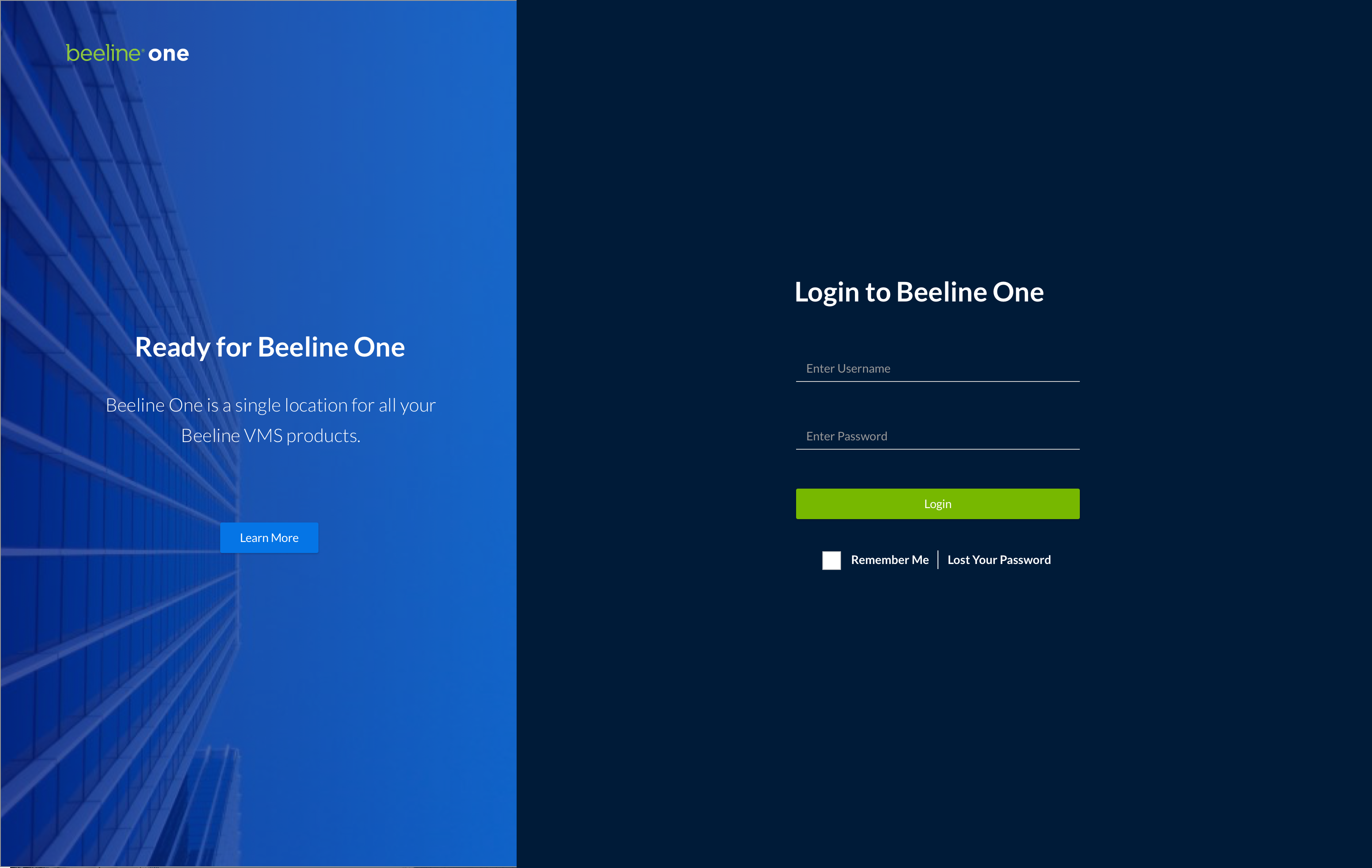
Login Screen
On this screen we use an Image Gradient Hero for the "Ready for Beeline One Section.
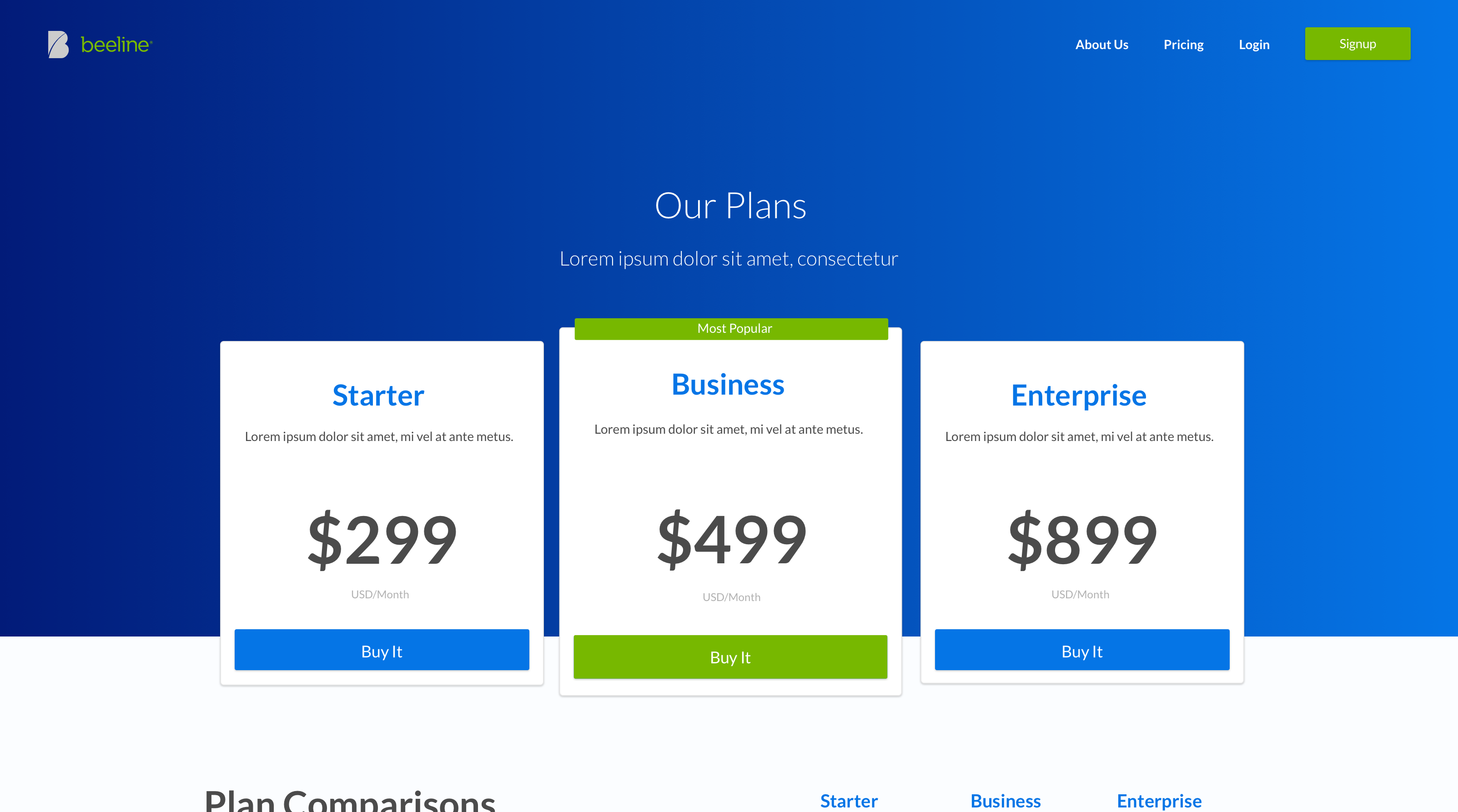
Pricing Table
On this screen we use our standard gradient hero and modify the content placement to be just above the pricing options. This screen is a mockup that was used as an example of our Credible products pricing screen.
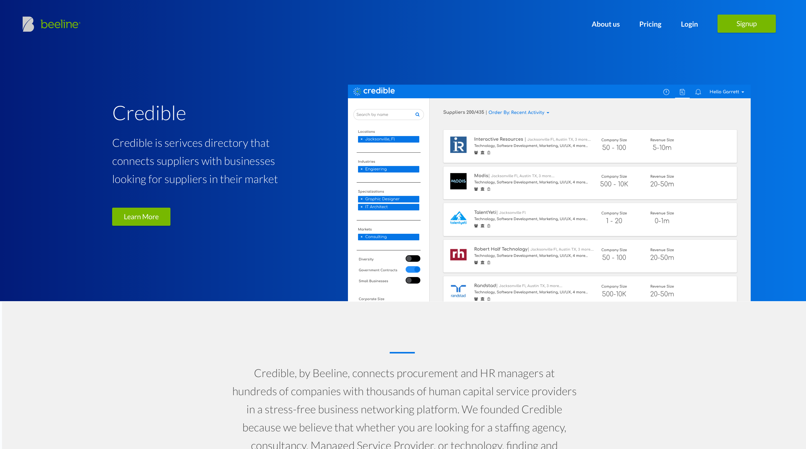
Credible
Here we are using our standard gradient with left alignment.
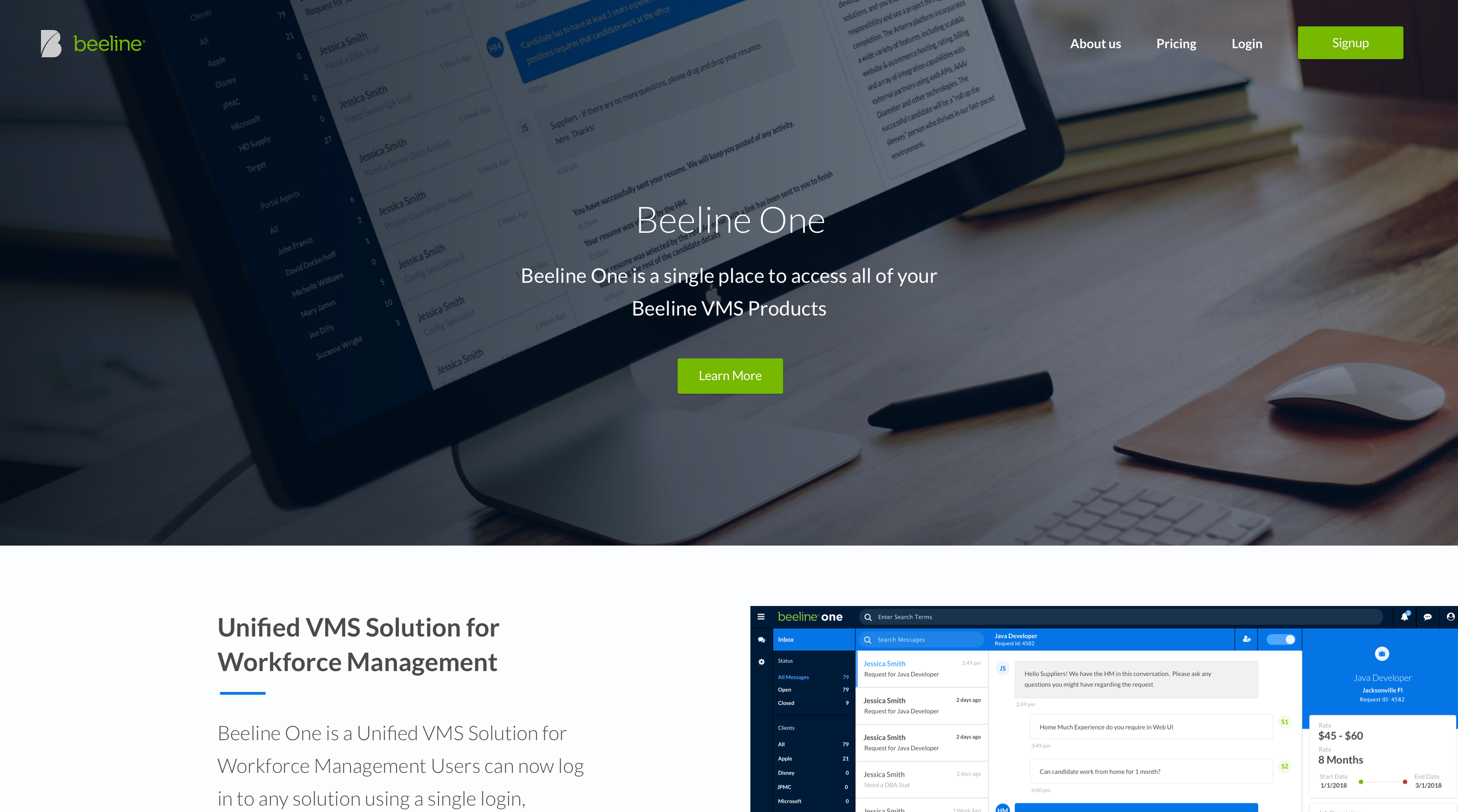
BeelineOne
Here we are using a centered alignment image Hero to introduce Beeline One on a product page mockup