
Buttons
Our Button Styles and Usage
Overview
Buttons are clickable items that give the user the ability to take action. Some basic examples of these include, saving, deleting, signing in, submitting forms and confirming dialogs.
Buttons vs Links
Buttons and links are both clickable HTML elements but their markup is fundamentally different. Because of this, they are often used incorrectly, and using the wrong element could negatively effect accessibility. Whereas buttons provide user’s with a clickable action, links provide the user with a way to navigate to a new page. The general rule of thumb is if clicking an element results in a new URL or a new perceived view then use a link. For everything else, use a button.
Buttons, Colors, and Naming
|
Default (Blue) |
This our default button style because it also is the color of our links, which re-enforces that they are a clickable element |
|
Primary (Green) |
Our Beeline Green buttons have historically been our primary button. The rule is, there may only be one primary button on a screen at any given time. |
|
Danger (Red) |
The danger button is used to indicate a descructive action such as deleting a profile or removing an asset. |
|
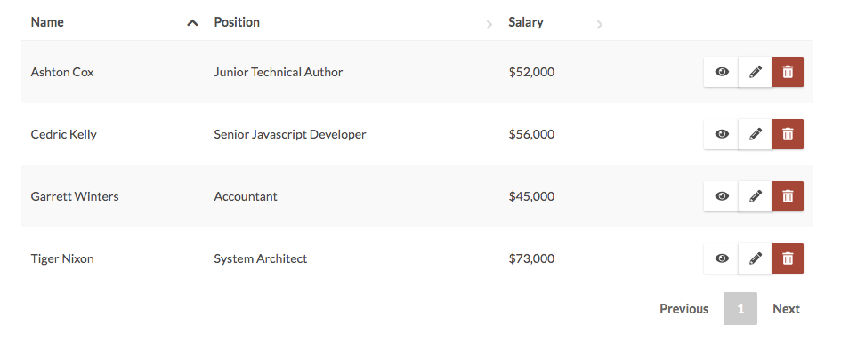
Neutral (White) |
Netural buttons are used when a screen requires many clickable elements that are in supporting roles. An example of this would be a large table with multiple actions. They are used to minimize distraction from the content they are supporting. They are also used in dialogs and a few other patterns where a second button is placed in close proximity to a primary or danger button. |
The Only One Primary Action Rule
Historically Beeline heavily used their primary brand color in their digital products. This color is a bright green known around the office as “Beeline Green” and has a hexadecimal code of #77b800. This resulted in green everywhere in our products. From labels to headers to links to buttons, the Beeline Green was saturating all UI elements. From a design perspective this devalued the Beeline Green’s purpose and created a situation where text, and actions weren’t 100% clear. Furthermore, this particular color of green reduces legibility at smaller sizes which is a challenge for users who are visual impairments.
The Primary Action Rule
There can be only 1 primary action on the screen at any given time. The primary action should represents the user’s main choice and final decision. Links cannot be a primary action, only buttons. Visually, the primary action will be represented by the primary button UI element.
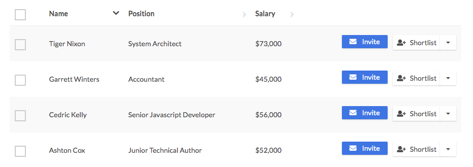
Blue vs. White Buttons
When adding actions to an experience we want to make sure that the colors we use to represent those actions relay their purpose. Green being our primary action has clearly defined rules around when to use. Blue our secondary and white our tertiary colors often get a lot of questions around usage. Our blue button can be used as a primary action but unlike our green primary, can exist multiple times on a view. So if you have a series of buttons and you want one of those buttons to stand out because it is the user’s most used action or final action, make it blue and leave the other’s white. If you have a series of buttons where none of the actions need to stand out to the user, use the white buttons. The reason for this is, by adding too many blue buttons to a view it can distract the user from the content they are trying to consume. The white buttons are clearly actions, but allow the content to retain the main user focus.
Getting Started
We've made some exciting improvements to Services Procurement. Would you like us to walk you through these changes?
Getting Started
We've made some exciting improvements to Services Procurement. Would you like us to walk you through these changes?
Labels and Text
Button labels should tell the user exactly what will happen if clicked so use verbs that describe the action clearly. Use sentence-style capitalization (only the first word in a phrase and any proper nouns capitalized) and no more than three words for button labels.
Examples of labels include, Save, Delete, Update, Add Service, Edit Data, Remove User
Using Icons
We encourage using icons when applicable. Icons add aditional visual context to the action, which helps re-enforce the messaging for the user.
- When choosing icons for an action, make sure the icon is visually related to the verbs used in the button text.
- The icon color should be the same color as the text it’s supporting.
Button Styles
Colors
| Button Name | Text & Icon Color | Background Color | On Hover Background Color |
|---|---|---|---|
| Default | White (#ffffff) | Blue Primary (#0575e6) | #0b82fa |
| Primary | White (#ffffff) | Green Primary (#77b800) | #87d20 |
| Danger | White (#ffffff) | Red1 (#be3a34) | #cb4741 |
| Neutral | Font Primary (#4b4b4b) | White (#ffffff) | #fafafa |
Globals
| Font Weight | Border Radius | Box Shadow | On Hover Box Shadow | Transition |
|---|---|---|---|---|
| 400 | 2px | 0 1px 2px 0 rgba(0, 0, 0, 0.2) | 0 0 20px 0 rgba(0, 0, 0, 0.4) | all .3s ease |
Examples
Disabled Buttons
For disabled buttons we want to make clear that the button cannot be interacted with. To do this we set the background color to gray, remove the box shadow and disable all button states, including :hover, :active, and :focus
| Background Color | Box Shadow |
|---|---|
| #bdbdbd | none |
Examples
Sizes
| Size | Font Size | Padding |
|---|---|---|
| Large | 1.286em | 15px 25px |
| Medium | 1em | 10px 20px |
| Small | 1em | 6px 15px |