
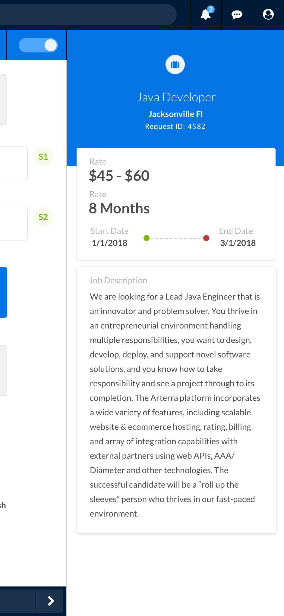
Request Details
In this example we use an action panel to provde additional details around a request.
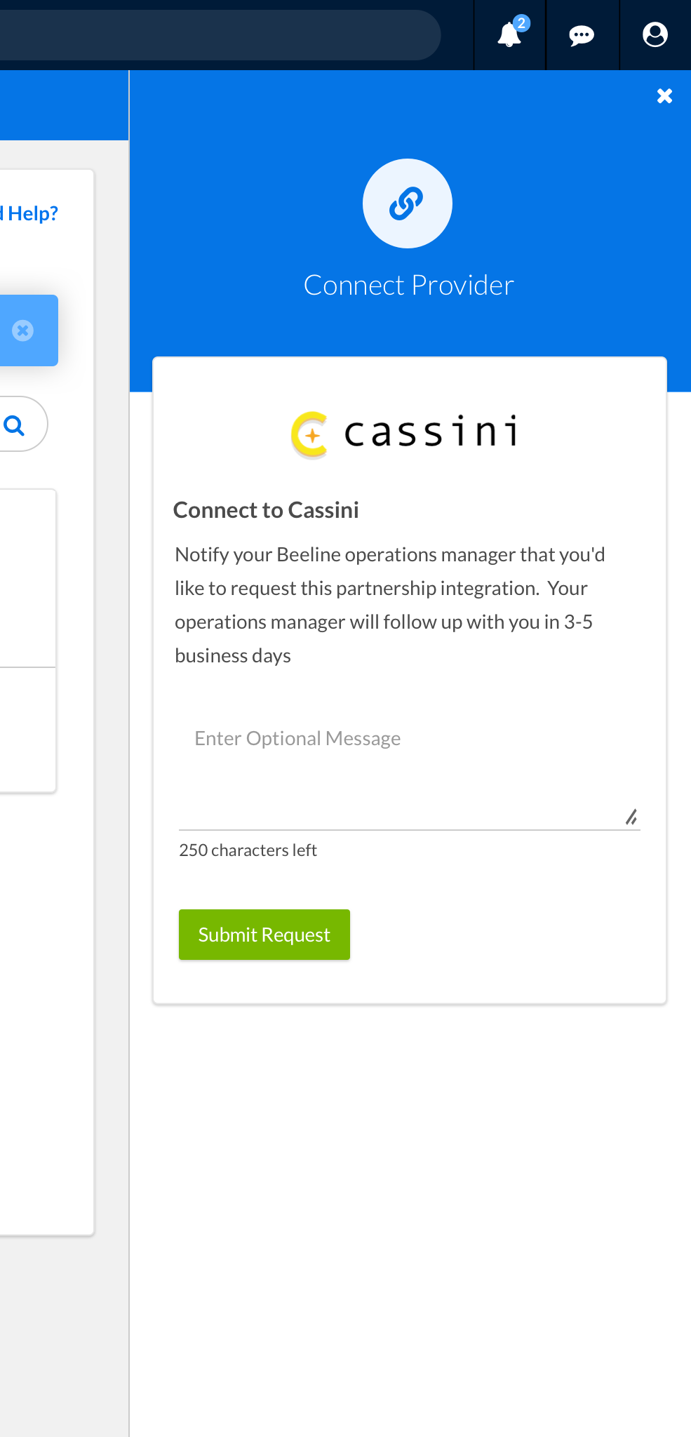
Connect Form
In this example we use an action panel to allow the user to send a request to their operations manager to connect to an intergration partner.
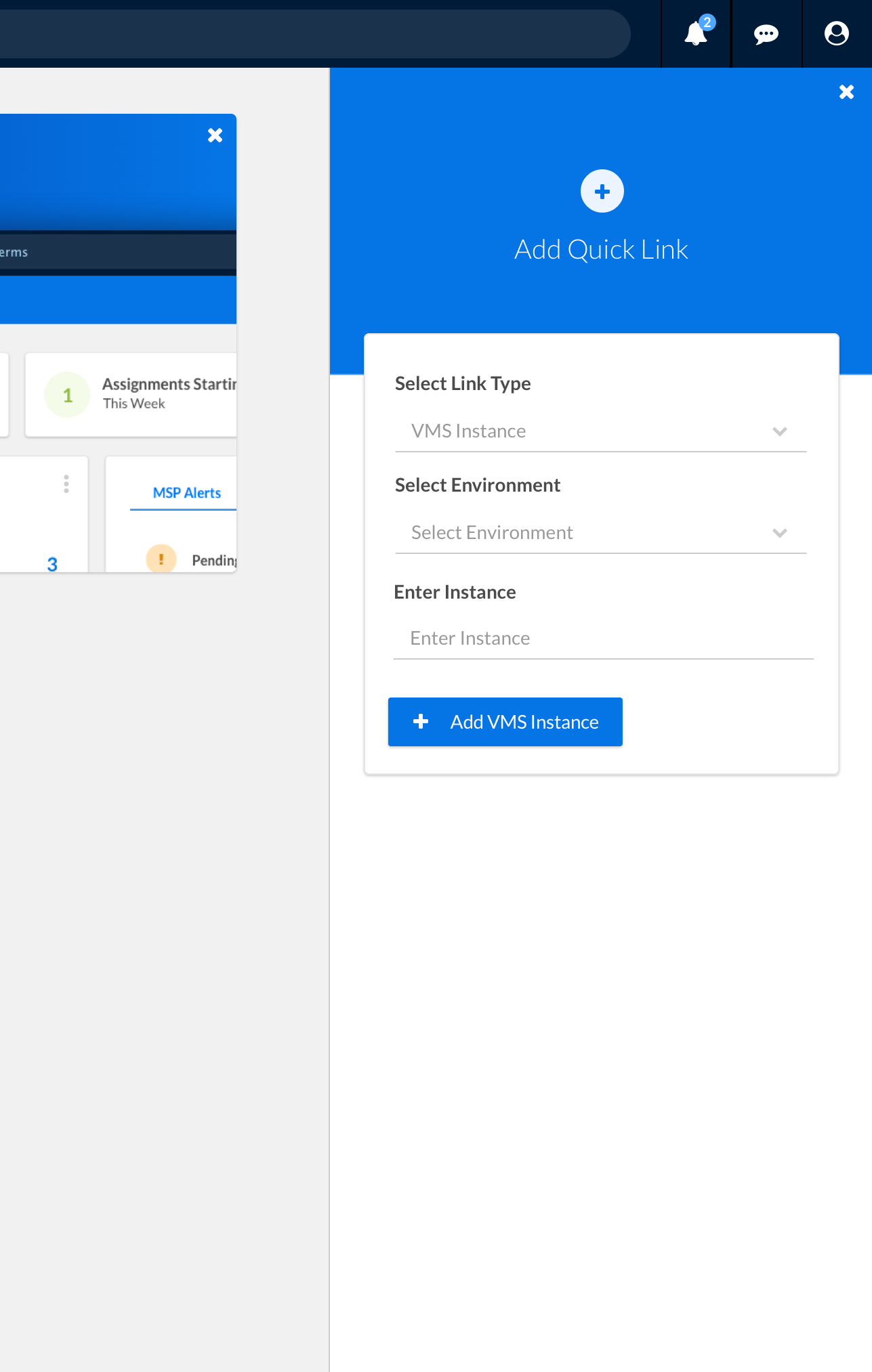
Adding A Quick Link
In this example we use an action panel to add a quick link to the Beeline One Launchpad.
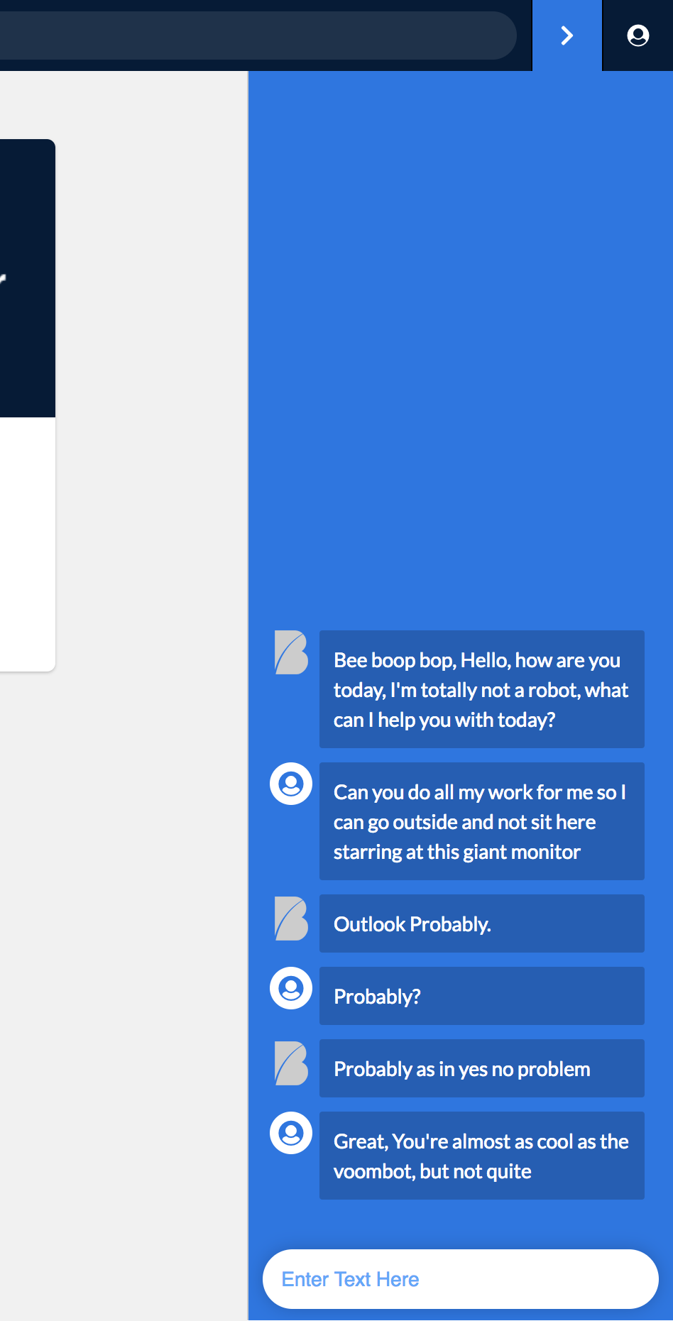
AI Chatbot
In this example we use an action panel to let our users interact with the Beebot
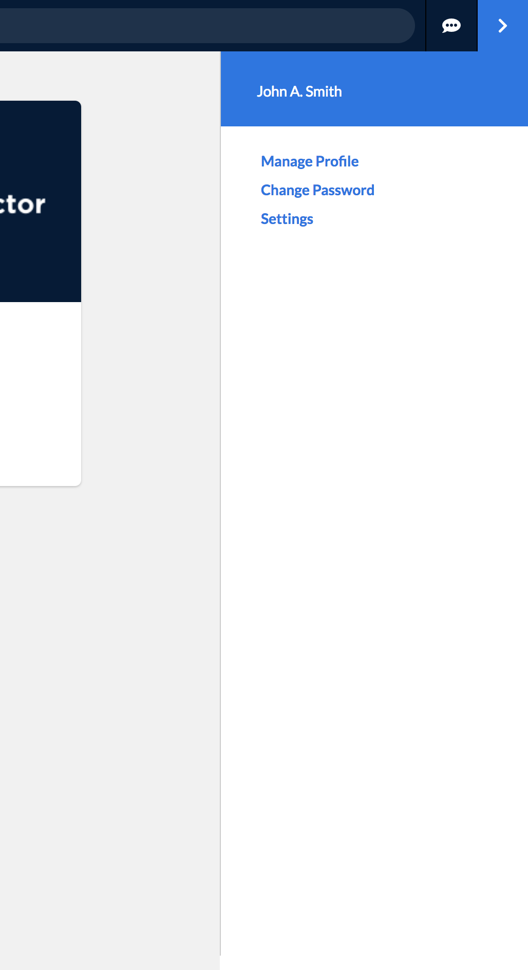
Secondary Navigation
In this example we use an action panel to show the user profile details and to allow the user to navigate user settings.